Three numbers worth knowing
Colour temperature, measured in kelvin, describes how warm or cool light appears. Most homes feel comfortable at 2700–3000 K; it flatters wood, paper and skin. Cooler 4000 K light can suit contemporary photography or stone, but mixing temperatures in one view looks patchy, so choose one and stay with it.
Colour rendering index (CRI) tells you how faithfully a lamp shows colour, on a scale up to 100. For art, look for CRI 90 or higher, and if the packaging lists R9 (saturated red), a higher value means reds and skin tones will not look muddy.
Light level, measured in lux, matters for conservation. Guidance from bodies such as the Canadian Conservation Institute and the CIE's technical report 157 on light damage suggests around 50 lux for highly sensitive items – watercolours, photographs, textiles, manuscripts – and roughly 150–200 lux for oil and acrylic paintings. Stone, metal and ceramics tolerate more. A free light-meter app gives a rough reading good enough for home use.
Fixture choices
Picture lights
Mounted on or above the frame, they wash the top of a single piece. Choose one roughly half the frame width, LED for low heat, and a model that projects far enough to reach the lower edge.
Track and spotlights
Flexible for changing walls. Narrow beams (15–25°) pick out objects; wider beams (36–60°) suit large canvases and groups.
Cabinet pucks and strips
Small LEDs inside cabinets lift glass and ceramics. Hide the source behind a lip or front rail so no one looks straight into it.
Daylight
Beautiful but strong in ultraviolet. Use sheer curtains or UV film on windows, and keep sensitive work off sunlit walls.
Defeating glare
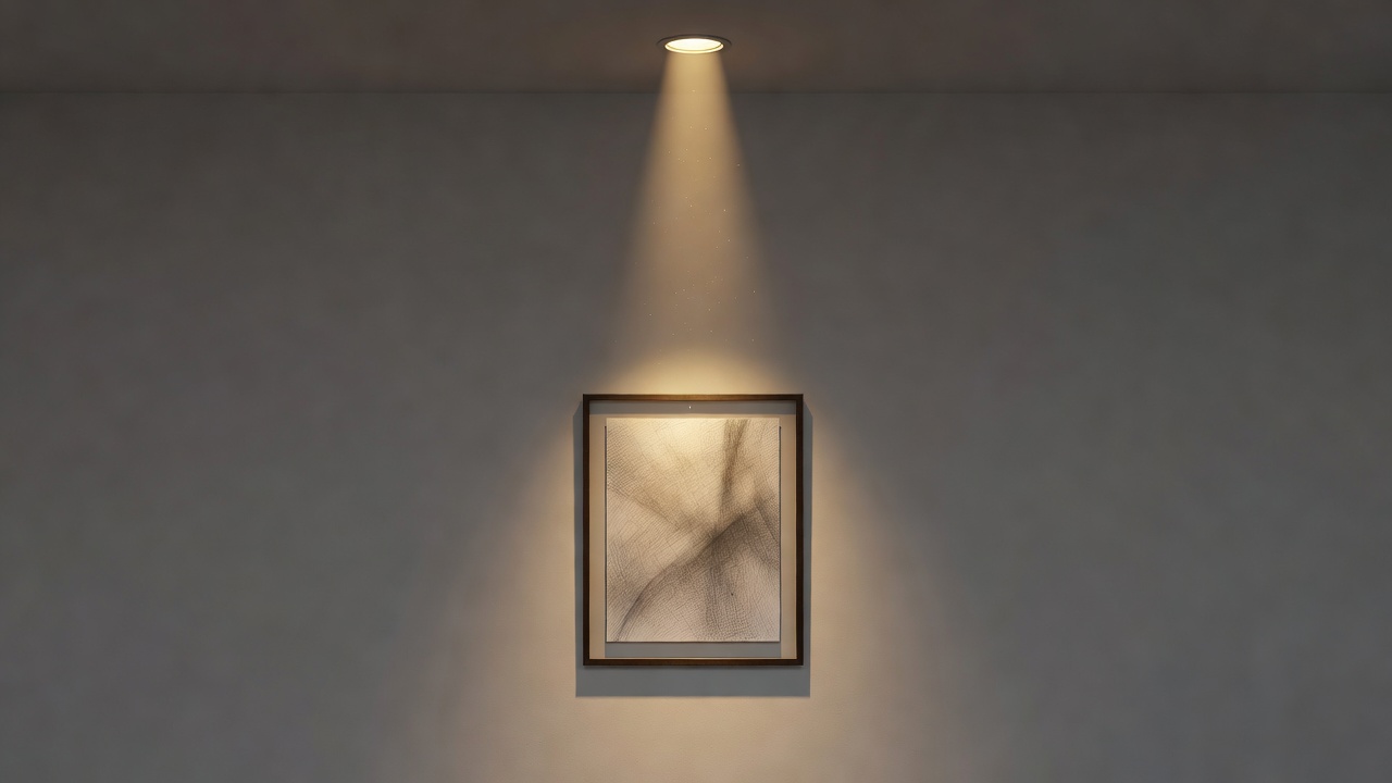
Glare happens when light hits glazing or varnish and reflects into the viewer's eye. The simplest fix is the angle: a light aimed at about 30° from vertical sends reflections down towards the floor rather than outward. For a standard 2.4 m ceiling and a picture centred at 145 cm, that puts a ceiling spot roughly 60–80 cm out from the wall. If a window opposite still causes reflections, anti-reflective museum glass or acrylic is worth the cost for a favourite piece.
Working positions
| Ceiling height | Distance from wall | Notes |
|---|---|---|
| 2.4 m | 60–80 cm | Typical living room; standard spots work well. |
| 2.7 m | 75–95 cm | Slightly narrower beam keeps light on the work. |
| 3.0 m | 90–110 cm | Period homes; consider track with adjustable heads. |
Care habits that protect colour
Use dimmers and timers
Prefer LED over halogen
Rotate the most sensitive pieces
Keep light sources away from objects
Layer the room, not just the wall
A display lit in a dark room looks theatrical; lit in a balanced room it looks at home. Keep some ambient light – a floor lamp, a table lamp – so the eye adjusts gently. Accent lighting should be only a few times brighter than its surroundings, not a stark spotlight. Many of the most welcoming collections, from the Frick Collection in New York to smaller house museums, rely on this soft layering rather than drama.